
Configure Flexible Scenario Comparisons in a Single Chart
This guide shows you how to compare multiple scenarios in a single chart while displaying totals for one scenario and detailed breakdowns for another.
You will create a mixed chart where:
Scenario 1 (for example, Basic) is shown as a total line.
Scenario 2 (for example, Discussion (Realistic Case)) is shown as a stacked breakdown.
Hidden elements remain part of the configuration but are not displayed in the chart or legend.
Prerequisites
You have access to a Workspace.
The node you want to analyze exists (for example, Gross Profit).
At least two scenarios are available.
Steps
1. Create a mixed chart on your target node
Open your Workspace.
Add a new mixed chart.
Select the node you want to analyze (for example, Gross Profit).
Keep the default axes:
X-axis: Time
Data series: Scenario
At this stage, scenarios are displayed across time.
2. Filter to two scenarios
Open the Filters section.
Filter the Scenario dimension.
Select the two scenarios you want to compare
(for example, Basic and Discussion (Realistic Case)).Save the filters.
3. Configure axes
Open Configure Axes.
Set:
X-axis: Time
Data Series:
Scenario
Engine (total)
Engine
Activate the Subtotals for x-axis toggle.
Confirm the configuration.
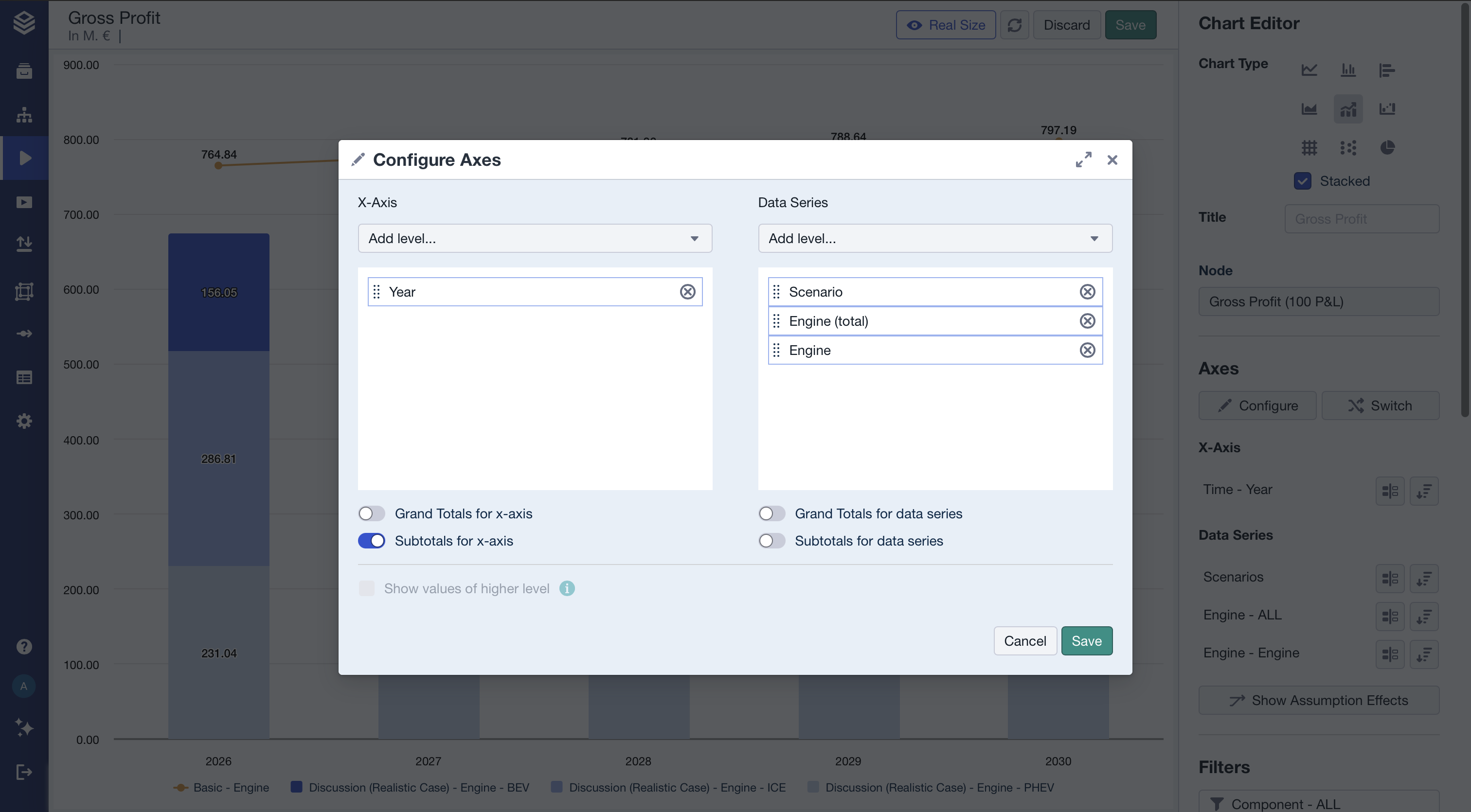
This setup enables both totals and detailed breakdown levels to coexist.
4. Configure data series visibility and chart types
Open Data Series styling.
In the list of series, locate the entries for both scenarios.
For Scenario 1 (e.g. “Basic”)
Keep only the Total visible.
Hide the detailed breakdown levels (e.g. ICE, BEV, PHEV).
Set the Total to display as a Line.
For Scenario 2 (e.g. “Discussion (Realistic Case)”)
Hide the Total.
Keep the detailed breakdown levels visible.
Confirm your changes.
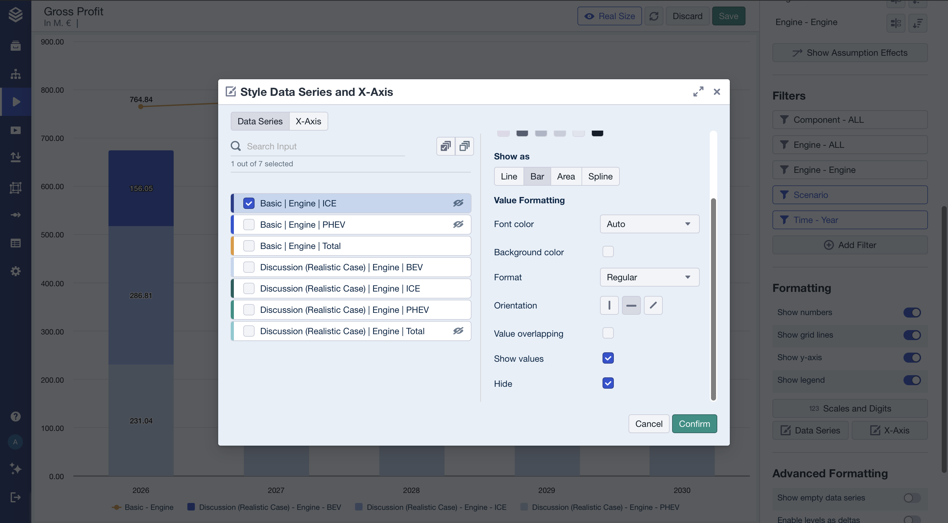
Click on the “Hide” checkbox at the bottom of the settings to hide a data series
5. Ensure bars are stacked
In the chart settings, activate Stacked.
Save the chart.
Result
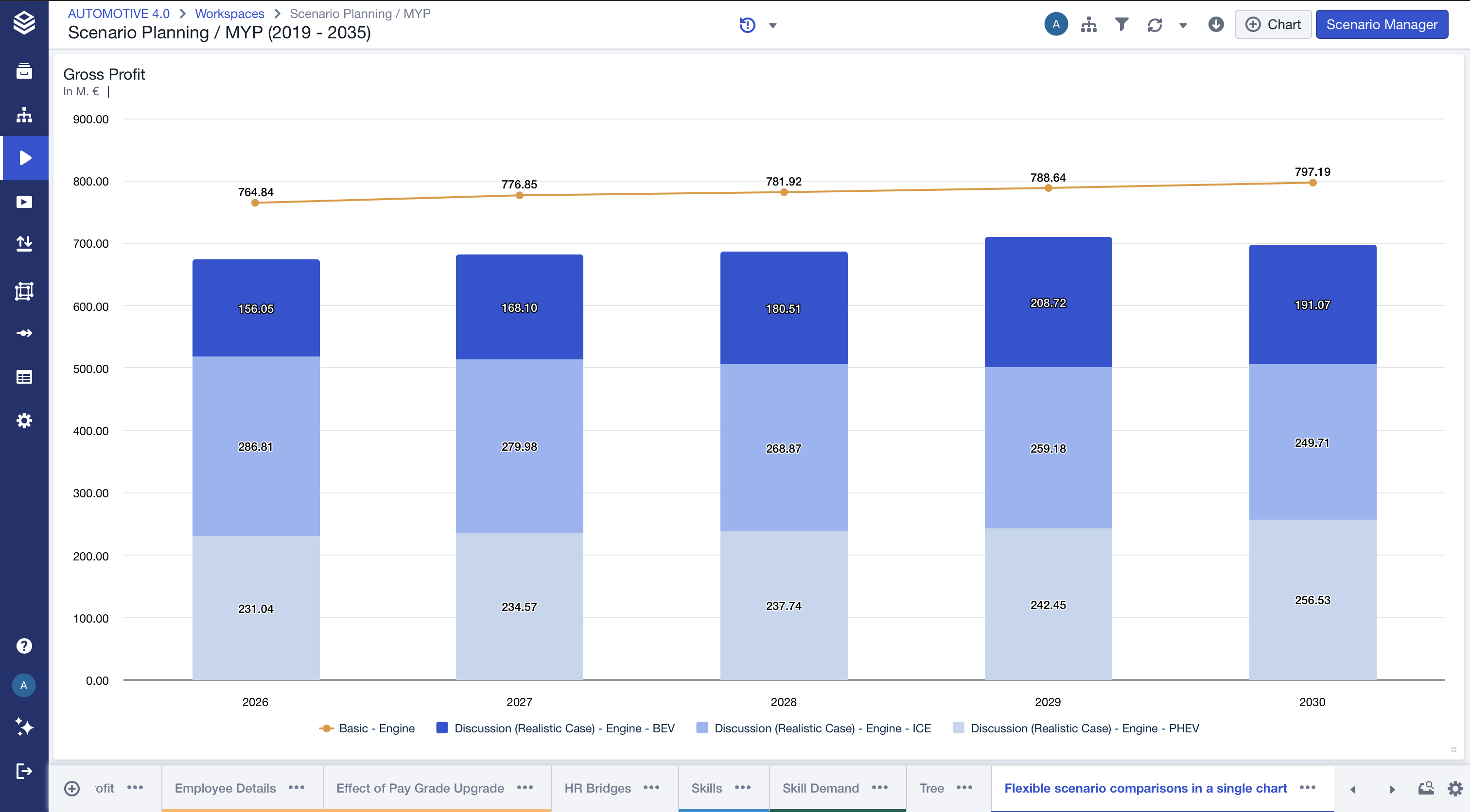
Your chart now displays:
Scenario 1 (e.g. Basic) as a single total line across time.
Scenario 2 (e.g. Discussion (Realistic Case)) as stacked bars showing internal composition.
This allows you to compare:
Overall performance differences between scenarios.
Structural drivers within one scenario.
Total vs. composition in a single, consolidated view.
The result is a flexible comparison layout similar to the illustrated example, where one scenario provides a benchmark line and the other reveals detailed category contributions in stacked form.
Troubleshooting
The totals are not appearing correctly.
Ensure that:
Subtotals for the x-axis are activated.
The “Total” level is included in the data series.
The filter behaves unexpectedly.
Select the scenarios first, then configure axes with the “All” level.