KPI Chart

Basic Overview
Displays one single number and unit
Can show a reference value for e.g. YoY comparisons
Used to highlight key performance indicators at first glance
Working with KPI Charts
Creating and Editing
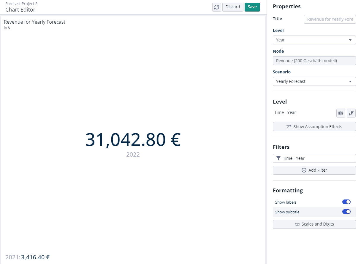
When creating a KPI chart, per default the first two years from your project horizon are used as reference values.
While “Year” is the default level when creating a KPI chart, every other level of your dimensionality can also be selected under “Level” in the chart editor.
The default order for KPI tiles has been adjusted to emphasize the most recent year.
The data of the primary level value of the selected level is displayed in the middle of the chart, while the data of the secondary level value is displayed in the lower left corner. With this arrangement, the focus is on the primary value, while the secondary value serves as additional reference when viewing the data.
The order of the level value (primary vs secondary) can be adjusted via the chart editor in the “Sort” dialog in the “Level” section.
Selecting other level values to be displayed in your chart can be done in the “Filters” section by selecting other level values.

Please keep in mind that KPI charts only support the visualization of two level values at a time (primary and secondary). Any additional selected level value will result in an error indicating that more than two values are selected.
Comparisons
For each KPI chart, a comparison can be added that displays the delta between to selected level values.
Per default, the comparison will be shown in the bottom left corner of the chart and indicate a positive delta in green and a negative delta in red.
In order to properly show a comparison as a secondary value, please make sure that only one other value is selected. If more than one value is selected, the comparison can not be displayed.
