Scenario Bridges
In this article, you will find a tutorial on how to create Scenario Bridges.
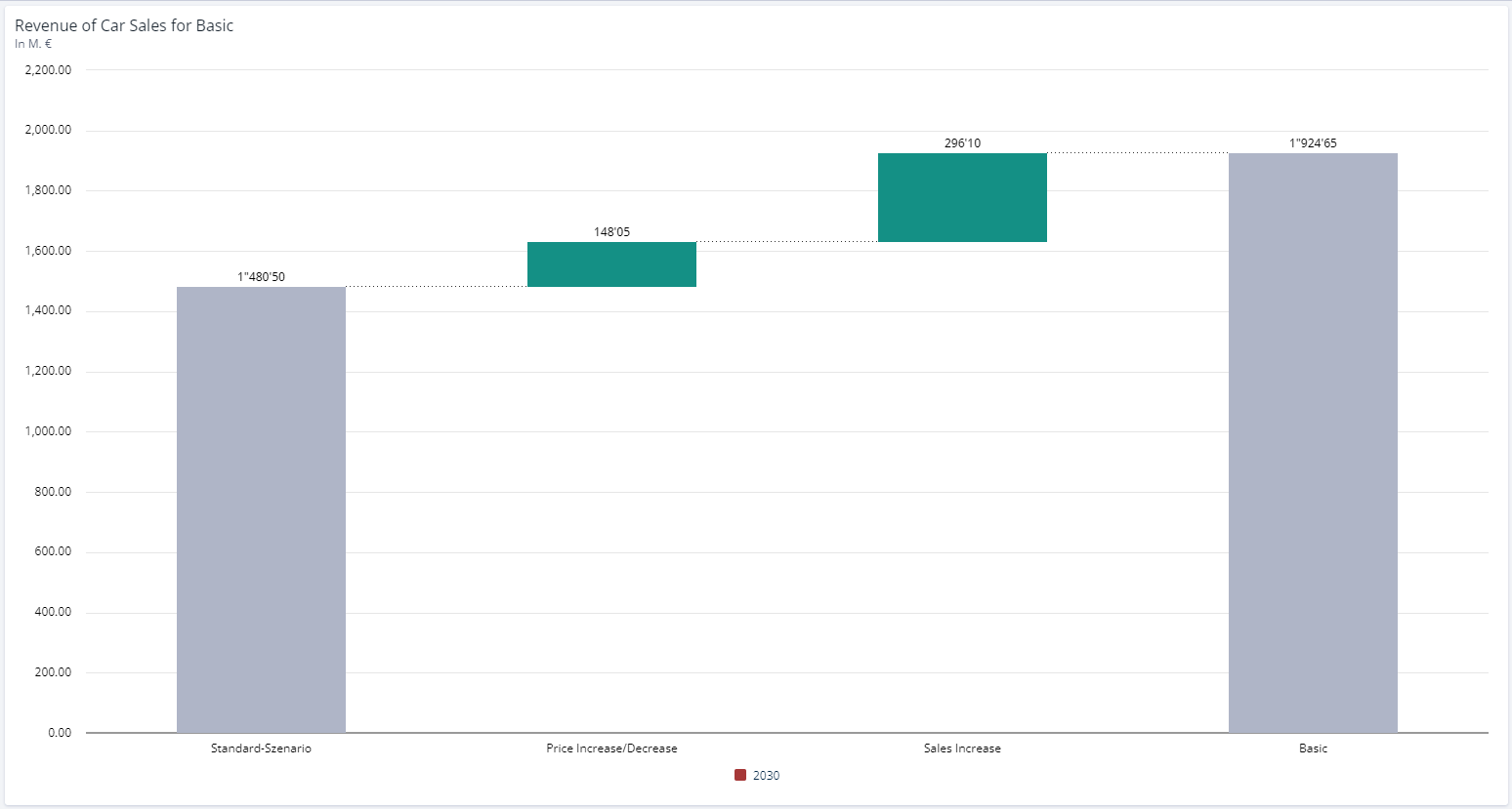
A Scenario Bridge visualises the difference between two or more scenarios via assumptions, line items or dimensions in a selected time period.
Creating a Scenario Bridge
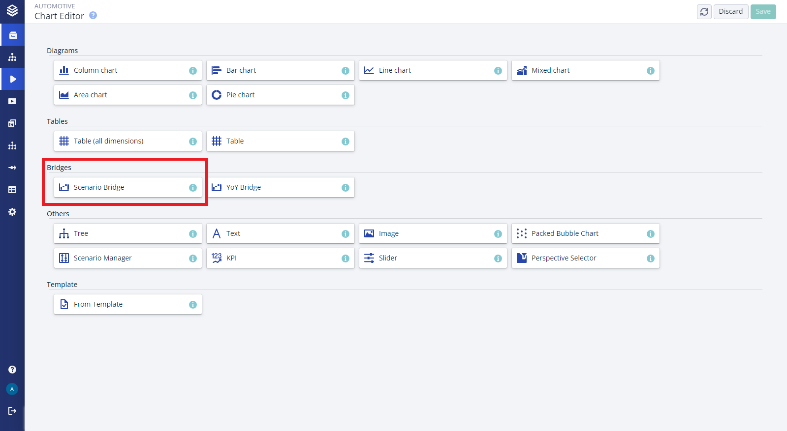
Click on the “Chart” button in the upper right corner on a worksheet.
Select “Scenario Bridge” in the chart selection.
Select a node to visualise
Select two or more scenarios to compare to each other
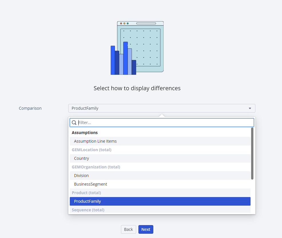
Select how you wish to visualise the difference, via assumptions, line items or a dimension
Select the time period you wish to show
Configuration Options:
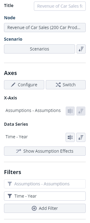
Node: The scenario bridge displays the data of the selected node in the model. You can change the node after the bridge is created by selecting a different node in the chart editor.
Scenario Selection: The scenario bridge shows your selected scenarios. Use the “Scenarios” button to select more or other scenarios that should appear in your chart.
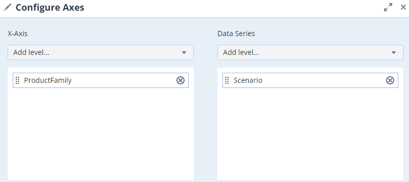
Configure Axes: You can use the “Configure” setting to either put single line-items, dimensions or assumptions on the axis. By default, the bridge will be created with the configuration of “Years” as the data series and “Assumptions (total)” on the x-axis.
Scenario Bridges with Line-Item Variants
The effects of line-item variants can be displayed in scenario bridges via the 'Configure Axes'- option in the workspace.
To do so, select 'Assumption line-items' when configuring the chart data.
The visualization will include the line-item name and the variant name.
Scenario Bridge with Dimensions as Deltas:
It is also possible to visualise the change between two scenarios by a dimension instead of the assumptions or line items.
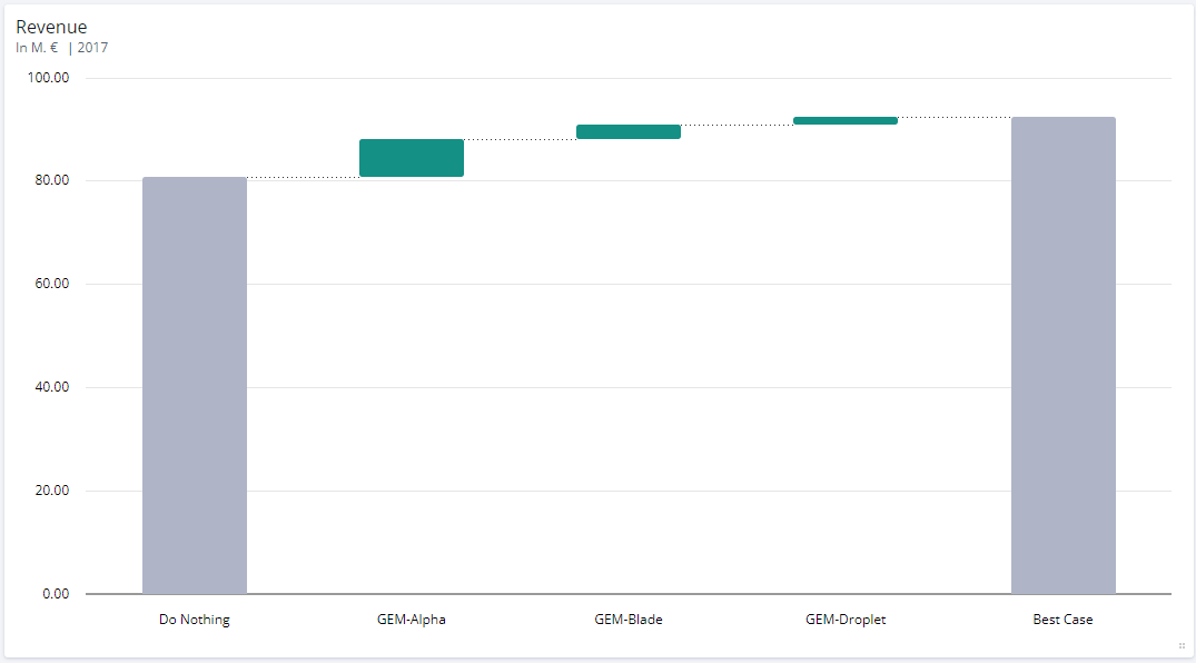
Scenario Bridge with Product Dimension shown as Delta
To configure a bridge to show dimensions instead of assumptions or line items, the chart can either be configured with the desired dimension as a delta in the bridge configuration wizard:
Or, if the chart has already been configured, by choosing a the desired dimension in the axis configuration selection.
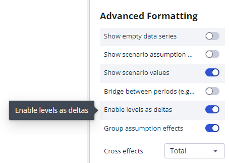
For the chart to show dimension levels as deltas the setting ‘Enable levels as deltas’ has to be enabled.
Assumptions Descriptions
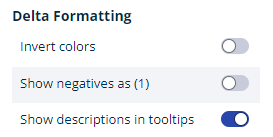
It is possible to show the assumption description in a bridge on hover over an assumptions bar.
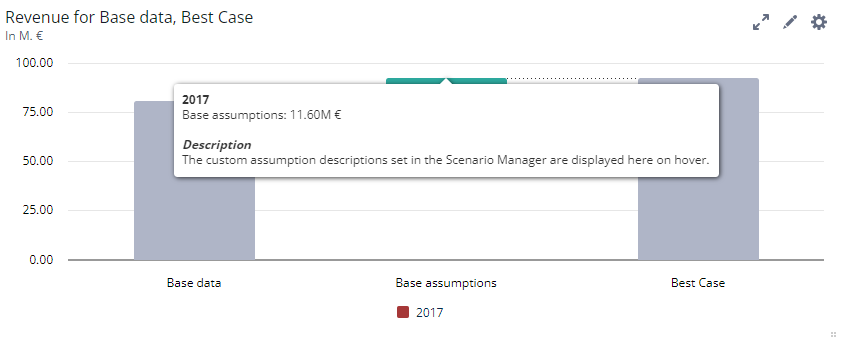
Clicking on an assumption’s name will open its settings:
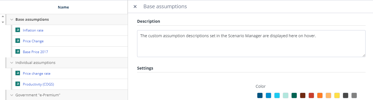
It is possible to set a custom description for this assumption in the description box. To display these descriptions on a chart on hover, enable the ‘show descriptions in tooltip’ setting in the charts inspector.