
Chart Configuration
Default Chart Settings
Learn how to sort your data in different charts and tables and how to structure them with colors or indentations.
When you have chosen a chart for your data series you often need to sort and format the chart elements to get a better overview of the data.
You can learn how to visualize your data in charts in this article: Data visualisation with different Chart types.
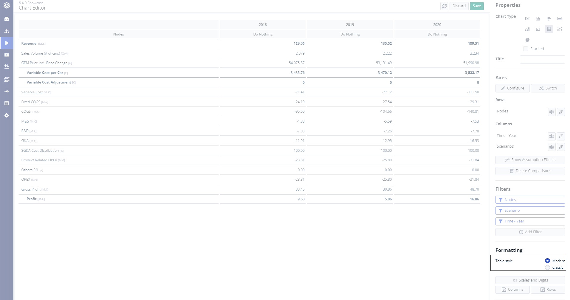
Select a chart and the chart editor will open on the right. There you can find the settings to sort and format your charts.
These settings are generally available for all charts but might differ in terms of naming or availability due to restrictions for certain charts.
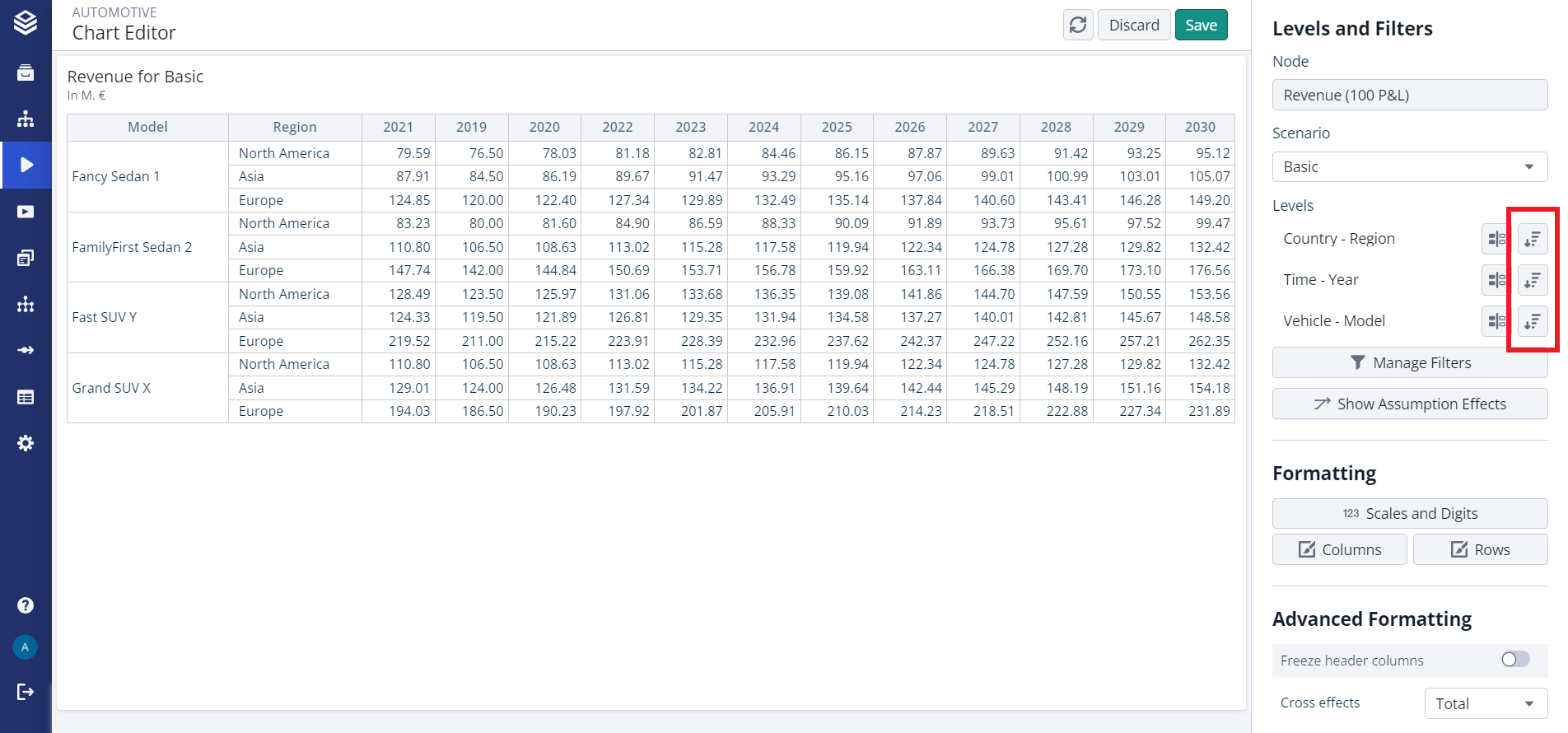
Sort Levels in Charts
To sort the level values shown in your chart, use the “Sort” button in the “Levels and Filters” section of the chart editor.
This option allows custom ordering for all level values per level via drag and drop.
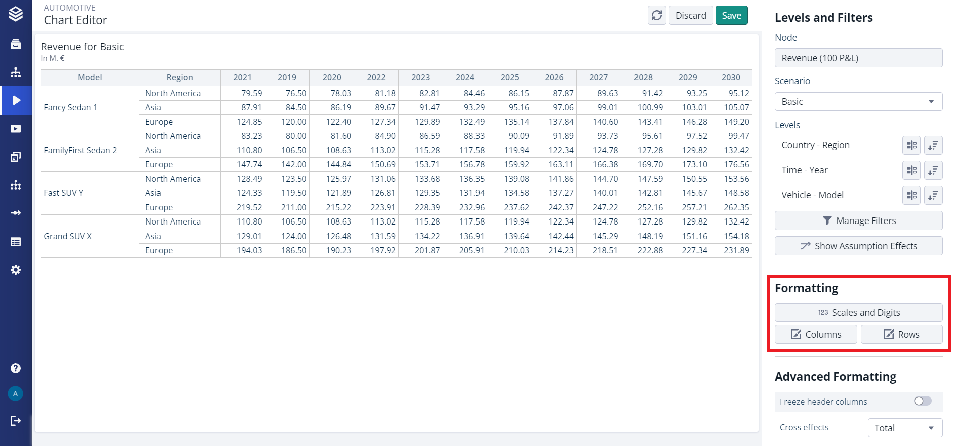
Format Charts
To format the appearance of a chart, navigate to the “Formatting” section in the chart editor.
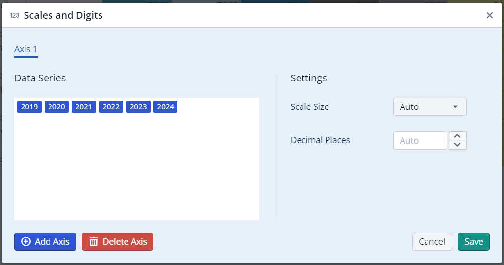
Formatting the Scales and Digits
With this setting you can define the level values for each axis and add more axis to your chart.
Additionally, you can define the scales and the digits for your chart.
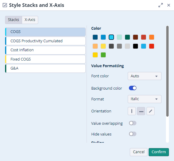
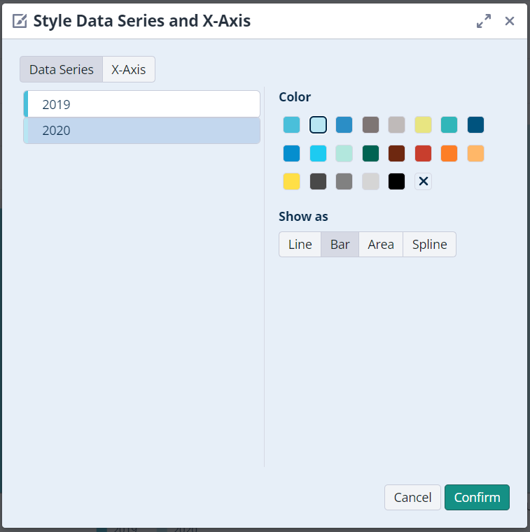
Formatting your Columns/Data Series
Here you have the option to assign colors to each column/data series in your chart. From version 6.4.0, you will also have the ability to flexibly format many more characteristics, such as:
Font colour
Text background
Format
Text orientation
Force show all values
Hide certain values
This will help you to highlight certain columns/data series or differentiate between columns/data series.
Mixed Charts
In mixed Charts you can also decide which data should be displayed as line, bar, area or spline.
Dynamic Font Sizing
With version 6.4.0, we have introduced the concept of instance-wide dynamic font sizing. This feature enables the automatic scaling of numbers and text on charts based on screen size.
This is an instance-wide setting that must be activated by an admin with the appropriate rights. Once activated, every user of this instance will benefit from dynamically scaling fonts.
.png?inst-v=ff212a86-856d-4898-9726-5520743f2e6f)
Valsight Settings > Settings
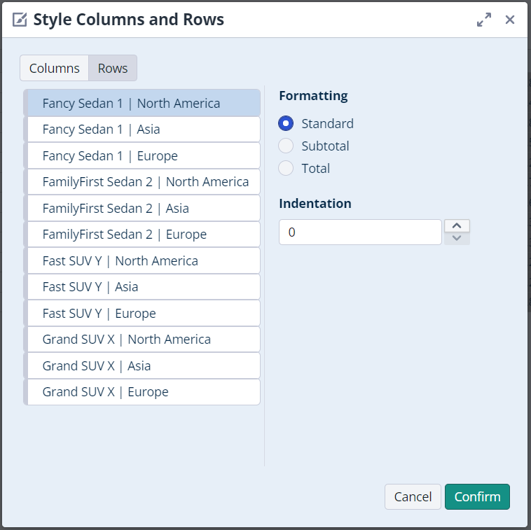
Formatting your Rows/X-Axis
In charts you can also set the format for each level value to highlight it in your chart or for example to show the calculation of sums more clearly.
Standard will display the level value as a normal text.
Subtotal will display the level value in bold with a horizontal line above it
Grand total will display the level value in the chart in bold with horizontal lines above and below.
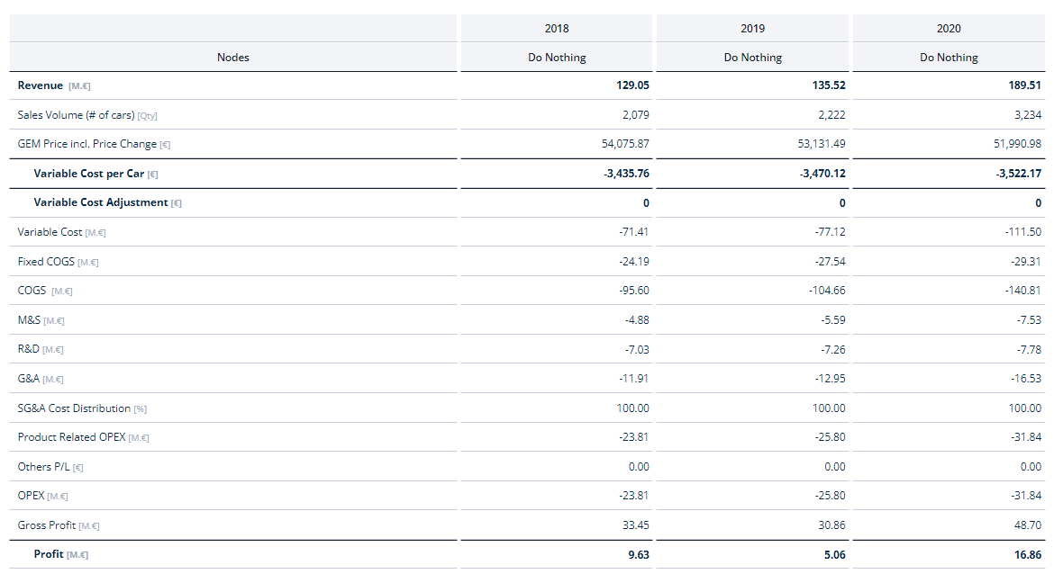
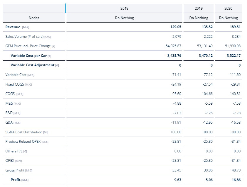
This way of formatting is especially useful for building financial statements like a profit and loss statement or a cash flow statement.
For an even better overview you can also indent the elements multiple steps. In combination with the formatting options, this will make e.g. your Tables look more structured and easier to interpret.
Modern Table Styles
With version 6.4.0, we have introduced a new and modern table chart style.
All newly created charts will use this style by default. The style can be configured through the table settings. Enabling this setting will also apply the new style to older tables.
Resizable Columns
The table columns will automatically resize to the best possible width for the current window size. You can also manually resize a table's columns by simply dragging them to the desired width. This column size will be saved and persisted. To reset a column to its initial width, double-click on the column's border.
Merged cells in Tables
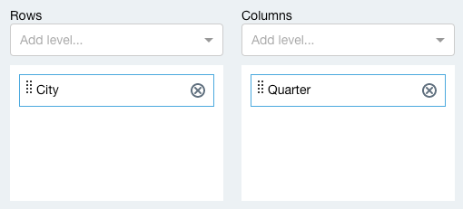
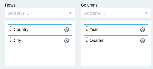
Cells in the table header or on the left side are merged when possible. Be sure to place them in the correct order in the rows or columns with the "Configure axes" dialog.
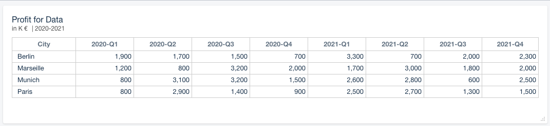
In the example below we added ‘Country’ above ‘City’ and ‘Year’ above ‘Quarter’ to display upper levels in merged cells and add columns with totals.
Configure Axes | Table |
|---|---|
 |  |
 | 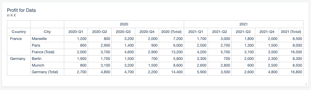 |
Note that levels have to be part of the same Dimension to be displayed as merged cells. In this example we used the Dimension Location with the levels Country and City and the Dimension Time with Year and Quarter.
Overlapping values in Charts
In Advance!
Due to overlapping data labels, not all values can always be shown. This can be solved by changing the sorting of the Nodes or using the feature of 'stack totals'.
A reoccurring issue related to Area Charts and Line Charts is, that the sorting of the Nodes (data series) influences the priority of labels in the Chart.
For example, when a chart features two nodes (Data table) and node B is sorted above node A, the chart will prioritize the label of node B and therefore, in case of overlapping labels will only show the label of node B (Example 1).
Example 1:
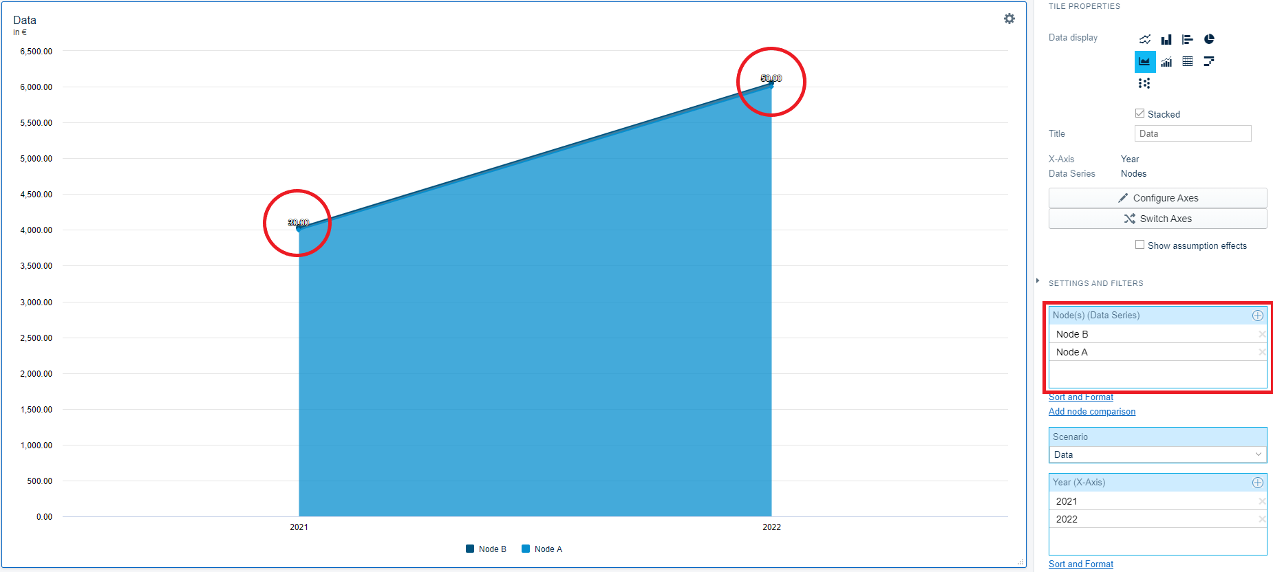
This does NOT mean that wrong numbers are displayed.
To change the prioritization of the nodes, click on 'sort and format' next to the node button and reorder the nodes.
To avoid overlapping labels, the feature of 'Stack totals' can be used.
In 'Example 2' the stack totals option 'Combined sum' is selected, which now shows the total value of both Nodes combined
Example 2:

More information on the 'Stack totals' - option can be found here.
Data table
Node | 2021 | 2022 |
|---|---|---|
A | 4000 | 6000 |
B | 30 | 50 |