
Configuring and Pivoting Data Displayed in Charts and Tables
If you are new to charts in Valsight, please read How to Create Charts & Tables and Sorting and Formatting Charts first.
Valsight works natively with high-dimensional data. For example, a single data point of the Sales node can represent a combination of a country, month, product, and channel dimensions (more on dimensionality). In many business cases, we want to combine different nodes into a table, each of them with different dimensionality, and additionally, we want to see the values for different scenarios and their compression. In this article, you will learn about the ways to create such charts and tables.
Pivot Tables and Charts
The simplest case is charting a single multidimensional node. After creating a table or a chart, use the configure axis button to select the desired level of aggregation. Aggregation calculation (e.g. Sum or Average) follows the Aggregation Settings set up previously in the model editor. Greyed-out dimension levels are not present in the node at hand. Scenarios and assumptions can be added in the same way as the regular dimensions. The configuration works the same for charts, tables, and YoY/Scenario bridges.
Example
Let's assume our data represents monthly clothing store sales in quantity for 2017 - 2019 in different countries across products belonging to product groups and different channels. Other than the time dimension (Year → Quarter → Month), we have the following dimensions:
Dimension | Flocation |
|---|---|
Dimension Level | FCountry |
Dimension Level Value | CH |
Dimension Level Value | DE |
Dimension Level Value | AT |
Dimension Level Value | Other |
Dimension | FProduct | FProduct |
|---|---|---|
Dimension Level | FProduct-Group | FProduct |
Dimension Level Value | Clothes | T-Shirt |
Dimension Level Value | Clothes | Pants |
Dimension Level Value | Accessories | Sunglasses |
Dimension | FChannel |
|---|---|
Dimension Level | FChannel |
Dimension Level Value | Offline |
Dimension Level Value | Online |
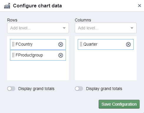
Configuring the Data
We want to see aggregate results for our business. We use the configured axes to aggregate the data to country, product group, and quarterly level disregarding the channel.
Dimensions can be moved between columns and rows per drag-and-drop:
Working with Totals
There are two different ways to add totals to your chart. First, you can insert grand totals to your chart via the “Configure” menu. Second, you can also add subtotals to your chart via the same menu. Both totals aggregate the visible data in your table to the visualized totals.
Grand totals
Subtotals
Alternatively, you can include a higher level of a dimension in your chart (e.g. add quarters to a monthly chart) to see the total of the higher level (quarter) while not taking set filters into account. That means that this setting aggregates all the data belonging to the higher level (including filtered values). This allows you to filter your table to certain months but still see the total of each quarter.
This can be configured via the checkbox below the grand and subtotals configuration.
Example:
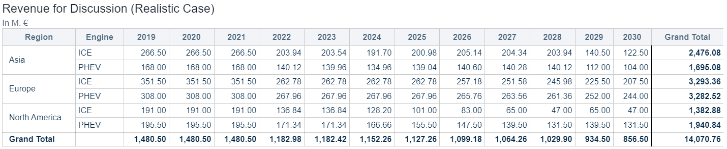
This is the original table.
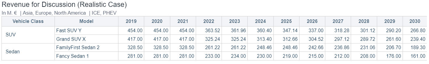
Original table
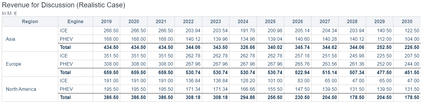
For this table, subtotals for each column have been activated.
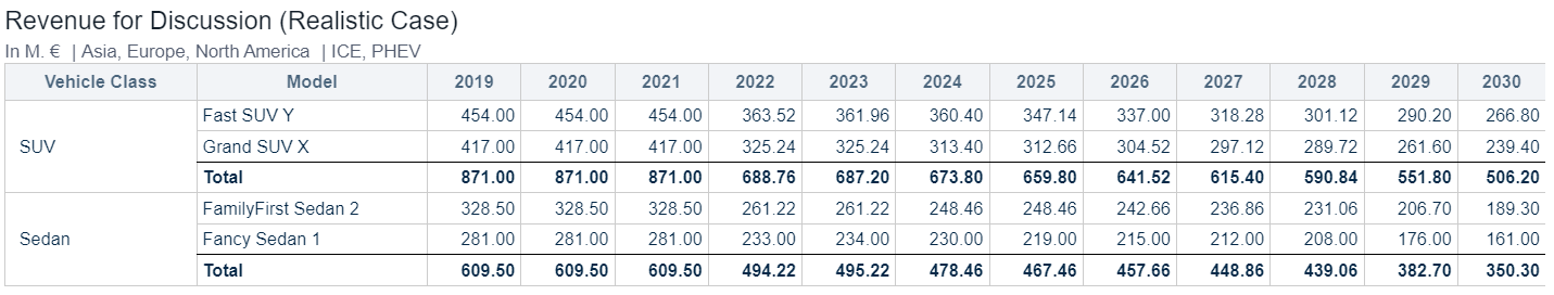
In this table, ‘Grand SUV X’ and ‘Fancy Sedan 1’ have been filtered out. The subtotals show the aggregation of the visible data.
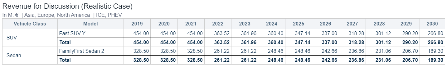
For this table, the checkbox “Show values of higher levels” has been activated. That is possible as ‘Model’ and ‘Vehicle Class’ are both levels of the same dimensionality.
What you see in the table, is that the SUV Total and Sedan Total show the aggregated total of the visible and the filtered level.
This is helpful in cases where comparisons between single level values and a level total are made.
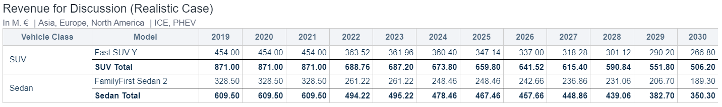
Limitations
Subtotals and the unfiltered value of the higher level cannot be shown at the same time
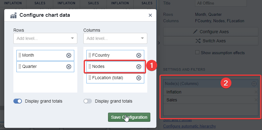
Combining different Nodes in a single Chart or Table
With Valsight, you can also add different nodes into a single chart or table. To do that, just add the nodes option in the “Configure Axes” dialog and afterward add the desired nodes using the tile settings. If you want to display a dimension (or dimension level) that is not present in all nodes selected, include the "*dimension name* (total)" for such dimension as well.
Let's say we want to display both inflation and sales in a table, we would add nodes into the “Configure Axes” dialog and add both nodes in the node's settings.
Configuration:
Result:
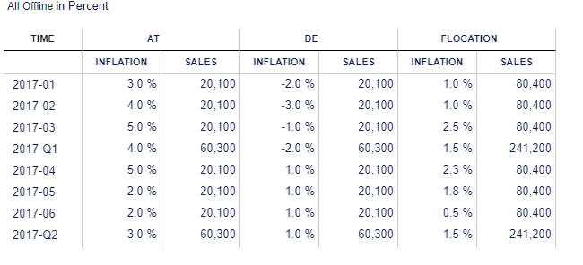
To show sales once again at the product level and still retain the inflation numbers, we would need to add both FProduct(Total) and FProduct into our table.
Special Options
With some specific settings, additional formatting is possible:
A table with nodes in rows has special formatting options described in Sorting and Formatting Charts as well as the possibility to create an automatic hierarchy.
Adding Assumptions to rows or columns gives two extra checkboxes: Creating YoY Bridges and showing assumption details